前一阵子花了很多时间做了春苗家长,最近有时间来做个小结,首先讲的是在做个人主页左侧列表时的几种方法试验。实际的效果可以到春苗个人主页查看。下面我为了突出主要部分,把列表适当简化下,假定我们要实现这样的一个列表: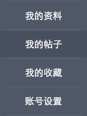
这个列表看着挺简单的,但做的时候发现为了找到最优解还是花了一番功夫的。我认为这里主要的矛盾在于分割线和hover背景的实现。下面就说说采用如下的同一套HTML结构,我的五种不同的方法尝试。
1 | <div class="cnt"> |
##方法一:
先说最容易最先想到的办法,使用伪元素做分隔线。
.cnt{
  width: 150px;
  height: 300px;
  padding-top: 50px;
  background-color: #505767;
}
ul{
  padding: 0;
  margin: 0;
  list-style: none;
}
li{
  text-align: center;
  background-color: #505767;
}
li::after{
  display: block;
  content: '';
  height: 0;
  margin: 0 10px;
  border-top: 3px solid #575e6d;
}
li.first::before{
  display: block;
  content: '';
  height: 0;
  margin: 0 10px;
  border-top: 3px solid #575e6d;
}
a{
  display: block;
  height: 46px;
  line-height: 46px;
  color: #ffffff;
  text-decoration: none;
}
a:hover{
  background-color: #484f5e;
}
兼容性处理:
很明显,ie8以下不支持伪元素,ie8也只支持老的伪元素写法:after。欲达到全浏览器兼容的效果,可以额外开一个标签来实现分隔线。但是这样子缺点更明显,需要增加无语义的标签。因此尽量不用。
##方法二:
第二种办法,利用li的hover效果实现背景色的改变,a链接元素的border实现分割线。a元素使用负margin-bottom使边框超出父元素li,同时li设置一个和背景同色,与a边框等宽的border,给a的边框留出空间。
.cnt{
  width: 150px;
  height: 300px;
  padding-top: 50px;
  background-color: #505767;
}
ul{
  padding: 0;
  margin: 0;
  list-style: none;
}
li{
  text-align: center;
  background-color: #505767;
  border-bottom: 3px solid #505767;
  *height: 46px;
}
li.first{
  border-top: 3px solid #505767;
}
li:hover{
  background-color: #484f5e;
}
a{
  display: block;
  height: 46px;
  line-height: 46px;
  color: #ffffff;
  text-decoration: none;
  margin: 0 10px;
  border-bottom: 3px solid #575e6d;
  margin-bottom: -3px;
}
li.first a{
  border-top: 3px solid #575e6d;
  margin-top: -3px;
}
兼容性处理:
- ie6下,非a链接元素hover样式无效。可能的解决方案:目前css父元素选择器标准还没有浏览器去实现,要让ie6下非链接元素hover生效,只能尝试通过一些脚本实现。
- ie6、7下,该方案无法得到预期的目的,子元素a的负margin-bottom对父元素高度没有任何影响,所以下边框无法超出父元素li,需要给li加一个和a等高的高度
*height: 46px;,如此一来,ie7表现正常,但是由于ie6下子元素是始终无法溢出父元素的(下面细说),a的下边框直接隐藏了,所以还需为ie6做特别优化。考虑到这里,我发现自己一开始的思路就有误,以至于越走越偏,这是一个不成熟的方案,于是有了方案三。
##方法三:
方法二改良版,同样给li加hover。利用父元素li的margin-bottom撑开3px的高度,给a边框留出空间,a元素使用position: relative,li与a等高。
.cnt{
  width: 150px;
  height: 300px;
  padding-top: 50px;
  background-color: #505767;
}
ul{
  padding: 0;
  margin: 0;
  list-style: none;
}
li{
  text-align: center;
  background-color: #505767;
  height: 46px;
  margin-bottom: 3px;
  _overflow: hidden;
}
li:hover{
  background-color: #484f5e;
}
a{
  position: relative;
  display: block;
  height: 46px;
  line-height: 46px;
  color: #ffffff;
  text-decoration: none;
  margin: 0 10px;
  border-bottom: 3px solid #575e6d;
}
li.first a{
  border-top: 3px solid #575e6d;
  top: -3px;
}
兼容性处理:
同样,ie6下,子元素会撑大父元素,所以a元素的下边框也被包含在li内了,达不到我们的效果。给li的margin-bottom只会增加li之间的间距,所以ie6下看起来li之间间距变大了。解决方案:为了让ie6子元素能溢出父元素,使用_overflow: hidden,多谢子元素relative时,ie6对overflow的错误处理!
遗留的问题:
- 方法二中的问题1依然存在。
- 这两种方法,a链接并不充满整个列表宽度,两边缘不可点击。
##方法四:
由于两个遗留的问题,上述两种方案并不优雅,我们换一种思路。用li元素来做边框,a链接元素加hover背景色。为了要让背景色充满整个宽度,a元素可以使用绝对定位。
.cnt{
  width: 150px;
  height: 300px;
  padding-top: 50px;
  background-color: #505767;
}
ul{
  padding: 0;
  margin: 0;
  list-style: none;
}
li{
  position: relative;
  text-align: center;
  background-color: #505767;
  margin-left: 10px;
  margin-right: 10px;
  height: 46px;
  border-bottom: 3px solid #575e6d;
  *vertical-align: middle;
}
li.first{
  border-top: 3px solid #575e6d;
}
a{
  position: absolute;
  color: #ffffff;
  text-decoration: none;
  line-height: 46px;
  left: -10px;
  right: -10px;
  _width: 150px;
}
a:hover{
  background-color: #484f5e;
}
兼容性处理:
- 这种定位方式的问题在于,ie6下,left和right不能同时生效,因此需要针对ie6加一个固定的宽度,才能使其充满。这就导致,在宽度不固定的情况下,这办法就变得不可用。
- ie6、7下,li之间会产生大概4像素的间距,这个间距跟border值无关,不明原因,但经过排查,初步诊断为行高的问题,给li加上
*vertical-align: middle得以解决。
##方法五:
此方法和上述方法异曲同工,这里利用了元素宽度不固定时,左右margin负值能把宽度撑宽的特点,使得a元素左右扩展占满整个列表宽度。
.cnt{
  width: 150px;
  height: 300px;
  padding-top: 50px;
  background-color: #505767;
}
ul{
  padding: 0;
  margin: 0;
  list-style: none;
}
li{
  text-align: center;
  background-color: #505767;
  border-bottom: 3px solid #575e6d;
  margin-left: 10px;
  margin-right: 10px;
}
li.first{
  border-top: 3px solid #575e6d;
}
a{
  display: block;
  color: #ffffff;
  text-decoration: none;
  line-height: 46px;
  margin-left: -10px;
  margin-right: -10px;
}
a:hover{
  background-color: #484f5e;
}
兼容性处理:
这个方法唯一的一个问题,就是ie6下,鼠标只有悬浮到文字上是才会出hover状态。但是这个hover态背景是充满整个宽度的,所以这个问题并不是很大。要解决的话,可以给a加宽度_width: 150px;来解决。
可见这个办法看似简单,得到的效果却很好,没有遗留问题,十分优雅!一开始怎么没想到呢~其实,如果基础足够扎实,应该一眼就能看出最好的解决方案。如果大家有更好的方法,一定要记得告诉我~
